Visualizing Custom Data in TradingView
Author : Ranga Technologies
Publish Date : 4 / 5 / 2026 • 1 mins read
Last Updated : 4 / 5 / 2026
Charts look clean. Indicators look familiar.
But what happens when you want to place your own data directly on the chart, not just price or standard indicators?
That’s where many traders pause.
So here’s the real question:
How far can Pine Script go when it comes to custom data visualization?
Pine Script allows traders to visualize custom data using tables, labels, plots, and drawing objects. While it cannot directly fetch external datasets, it provides strong flexibility for representing calculated or structured inputs. This guide explains how to build these visuals step-by-step, includes real code examples, highlights limitations, and connects how PineGen AI can improve the workflow.
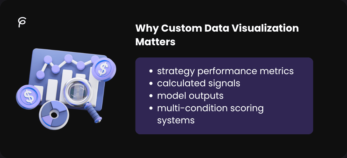
1. Why Custom Data Visualization Matters
Most traders stick to default indicators, but custom data gives you more control,like:
-
strategy performance metrics
-
calculated signals
-
model outputs
-
multi-condition scoring systems
Instead of switching tools, you can bring everything into one visual space.
If you want to understand how these visuals fit into strategy logic, this breakdown helps:
2. What Pine Script Allows
Pine Script runs inside TradingView and focuses on rendering data on charts.
You can:
-
draw labels, lines, and boxes
-
display structured data using tables
-
plot custom values directly
But it does not support external API connections or importing datasets.
3. Visualization Methods in Pine Script
- Tables
Best for structured data like metrics or dashboards.
- Labels
Used to mark events like signals or conditions.
- Plots
Used for continuous indicators or overlays.
- Background Coloring
Used to highlight market conditions visually.
4. Step-by-Step Implementation
Define Data
customScore = close - open
trend = ta.sma(close, 20)
Choose Visualization
Table → structured data
Label → events
Plot → continuous signals
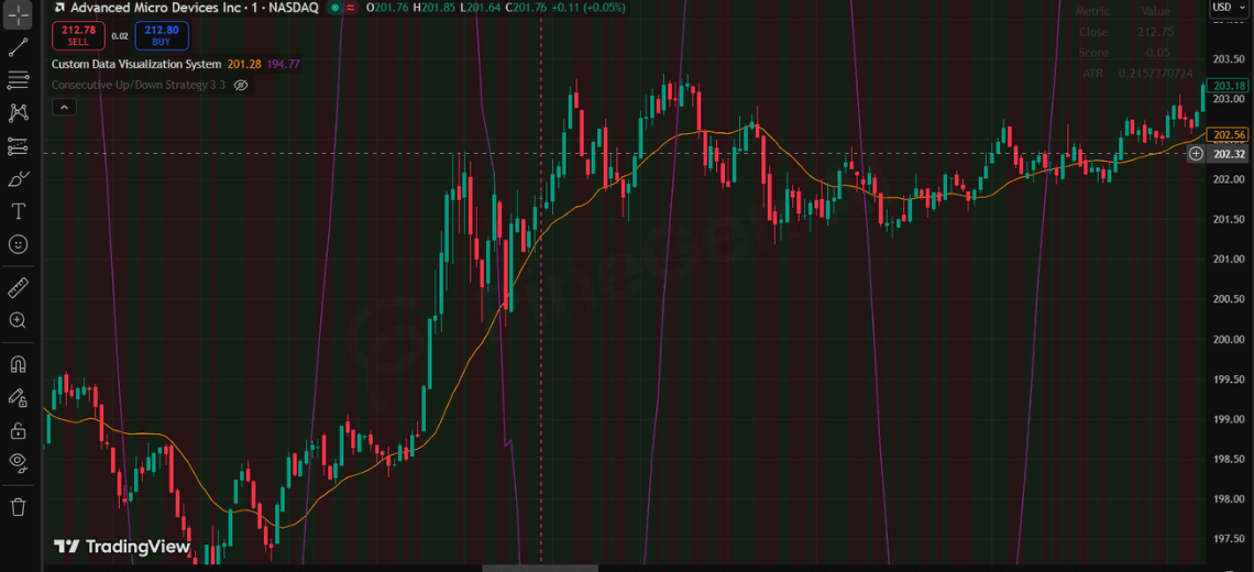
5. Full Code Example
//@version=6
indicator("Custom Data Visualization System", overlay=true)

// ----------------------
// DATA
// ----------------------
customScore = close - open
trend = ta.sma(close, 20)
volatility = ta.atr(14)

// Simulated external-style data
externalData = math.sin(bar_index * 0.1) * 10

// ----------------------
// TABLE
// ----------------------
var table t = table.new(position.top_right, 2, 4)

if barstate.islast
    table.cell(t, 0, 0, "Metric")
    table.cell(t, 1, 0, "Value")

    table.cell(t, 0, 1, "Close")
    table.cell(t, 1, 1, str.tostring(close))

    table.cell(t, 0, 2, "Score")
    table.cell(t, 1, 2, str.tostring(customScore))

    table.cell(t, 0, 3, "ATR")
    table.cell(t, 1, 3, str.tostring(volatility))

// ----------------------
// LABELS (avoid spam)
// ----------------------
if customScore > 0 and barstate.islast
    label.new(bar_index, high, "Bullish", color=color.green)

if customScore  0 ? color.new(color.green, 90) : color.new(color.red, 90))

// ----------------------
// ALERTS
// ----------------------
alertcondition(customScore > 0 and close > trend, "Bullish Alert", "Bullish setup")
alertcondition(customScore < 0 and close < trend, "Bearish Alert", "Bearish setup")
6. Limitations You Should Know
-
No direct external API access
-
Object limits for labels, lines, and tables
-
Performance issues if visuals are overused
-
Works only inside TradingView
7. PineGen AI Workflow Advantage
Writing Pine Script manually can get repetitive.
PineGen AI helps by:
-
generating Pine Script faster
-
reducing syntax errors
-
structuring visualization logic
-
speeding up strategy development
8. Conclusion
Visualizing custom data in TradingView is about working within Pine Script’s structure, not forcing it beyond limits.
Tables, labels, and plots each serve a specific purpose, and when combined properly, they can turn a chart into a decision-making system.
If you want to reduce manual coding effort and build cleaner, structured Pine Script faster, tools like PineGen AI can make that process smoother.